
Blog / Add a global dark mode with Tailwind CSS

Add a global dark mode with Tailwind CSS

3 min - 13 Sep 2023

TL;DR: How to quickly implement a dark mode with the help of Tailwind CSS and around ten lines of code.
You will find the source code via this Github Repository. Find out more on Capsules, X or Bluesky.
The main element of this article is the dark variant that can be configured in the Tailwind CSS configuration file. Adding the class value to darkMode activates the CSS classes only when the dark class is present. The media value, on the other hand, is based on the operating system's preferences.
tailwind.config.js
export default {
  content: [ ... ],
  darkMode : 'class',
  theme : { ... },
  plugins : [ ... ],
}
Two CSS classes will modify all elements on the page. These classes are written directly in the app.css file alongside the TailwindCSS directives.
resources/css/app.css
@tailwind base;
@tailwind components;
@tailwind utilities;

@layer components
{
    .dark-mode
    {
        @apply dark:invert dark:-hue-rotate-180 dark:saturate-100 dark:brightness-90;
    }

    .dark-image-mode
    {
        @apply dark:invert dark:hue-rotate-180 dark:saturate-[1.25];
    }
}
The dark-mode class is the one that inverts the entire page, including the images. To preserve certain images from these modifications, we assign them the dark-image-mode class. The role of this latter class is to neutralize the changes made by the dark-mode class.
The addition of dark mode is determined by the dark class applied here to the body element in the welcome.blade.php file.
welcome.blade.php
<!DOCTYPE html>
<html lang="{{ Str::snake( app()->getLocale() ) }}">
<head>
<meta charset="utf-8">
<meta name="viewport" content="width=device-width, initial-scale=1">
<title>Capsules Codes - Set up a global dark mode quickly with TailwindCSS</title>
@vite( 'resources/css/app.css' )
</head>
<body class="dark">
<div class="bg-primary-white dark-mode">
<div class="w-screen h-screen flex justify-center font-sans text-primary-black">
<div class="flex flex-col items-center justify-center text-center">
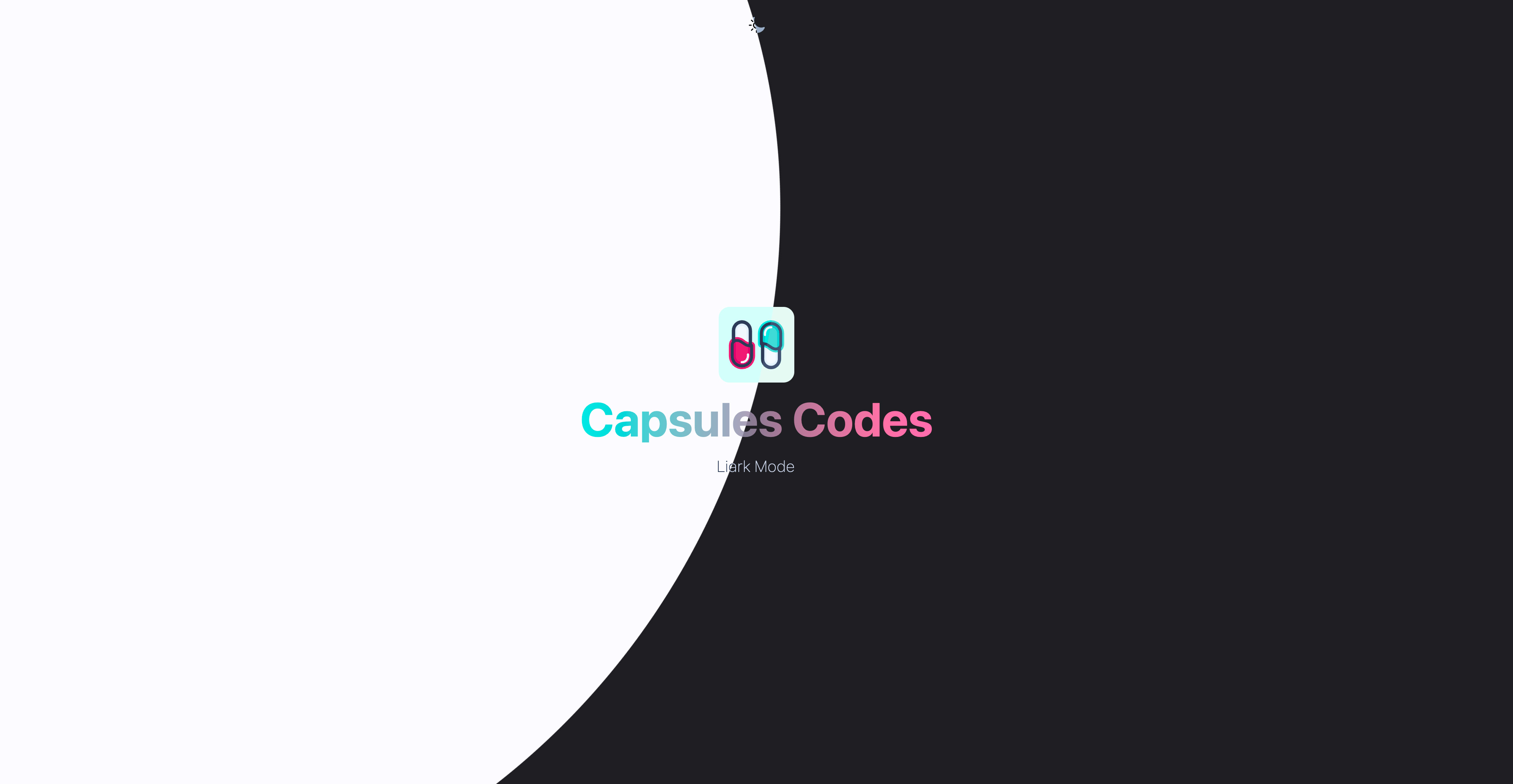
<img class="w-24 h-24 dark-image-mode select-none" src="/assets/capsules-logotype-red-blue-home.svg" alt="Capsules Codes Logotype">
<h1 class="mt-4 text-6xl font-bold select-none header-mode">Capsules Codes</h1>
<h2 class="mt-4 text-xl font-extralight tracking-wide">{{ Request::path() !== 'dark-mode' ? 'Light Mode' : 'Dark Mode' }}</h2>
</div>
</div>
<div>
</body>
</html>

The colors of the page content are now inverted. By adding a button that allows switching between dark mode and light mode, we achieve the expected result.
In the context of this article, the sample project is based solely on Blade. The button then calls two routes: /dark-mode and /light-mode, each indicating to the content whether it should invert the colors of the page or not.
web.php
<?php

use Illuminate\Support\Facades\Route;

Route::get('/{mode?}', fn() => view( 'welcome' ) );
welcome.blade.php
<body class="{{ Request::path() !== 'dark-mode' ? '' : 'dark' }}">

        <div class="w-screen h-screen relative flex flex-col bg-primary-white dark-mode">

            <div class="absolute w-full h-16 flex items-center justify-center" >

            @if( Request::path() !== 'dark-mode' )

                <a href="/dark-mode" class="p-2 rounded-md outline-none hover:bg-slate-50">

                    <img class="w-6 h-6 dark-image-mode select-none" src="/assets/capsules-sun-icon.svg" alt="Sun icon">

                </a>

            @else

                <a href="/light-mode" class="p-2 rounded-md outline-none  hover:bg-slate-50">

                    <img class="w-6 h-6 dark-image-mode select-none" src="/assets/capsules-moon-icon.svg" alt="Moon icon">

                </a>

            @endif

            </div>

            <div class="grow flex justify-center font-sans text-primary-black">

                <div class="flex flex-col items-center justify-center text-center">

                    <img class="w-24 h-24 dark-image-mode select-none" src="/assets/capsules-logotype-red-blue-home.svg" alt="Capsules Codes Logotype">

                    <h1 class="mt-4 text-6xl font-bold select-none header-mode">Capsules Codes</h1>

                    <h2 class="mt-4 text-xl font-extralight tracking-wide">{{ Request::path() !== 'dark-mode' ? 'Light Mode' : 'Dark Mode' }}</h2>

                </div>

            </div>

        <div>

    </body>
The elements are then influenced by Request::path() !== 'dark-mode’.
Changing the mode using JavaScript allows for a smooth transition from dark mode to light mode via the Tailwind CSS classes transition-all duration-300 ease-in-out. These classes can be applied to the new classes dark-mode and dark-image-mode. The result is much more visually appealing.
The dark-image-mode class, by reversing the values of the dark-mode class, does not return the image to its original colors. The resulting image is slightly duller. The result remains satisfactory.
Glad this helped.