Blog / Display a modal using Vue and its Teleport component

Display a modal using Vue and its Teleport component

4 min - 02 Oct 2023
TL;DR:How to quickly implement a modal with Vue using its built-in Teleport component.
You will find the source code via this Github Repository. Find out more on Capsules, X or Bluesky.
While using a modal might seem obvious on a website, its implementation can sometimes be complex. To simplify this task, the Vue framework has introduced its built-in component <Teleport>. This component allows us to “teleport” a portion of a component's template into an existing DOM node outside of the component's DOM hierarchy.
Let's now determine the location of this external node by assigning the id capsules to Welcome.vue.
/resources/js/pages/Welcome.vue
<script setup>

import logotype from '/public/assets/capsules-logotype-red-blue-home.svg';

</script>

<template>

    <div id="capsules" class="w-full min-h-screen flex flex-col font-sans text-primary-black">

        <div class="grow mx-8 lg:mx-auto max-w-screen-lg overflow-auto flex flex-col items-center justify-center text-center">

            <img class="w-24 h-24" v-bind:src="logotype">

            <h1 class="mt-4 text-6xl font-bold select-none header-mode" v-text="'Capsules Codes'" />

        </div>

    </div>

</template>
This Vue component is, in fact, an InertiaJS page called when accessing the main route specified in the web.php file.
routes/web.php
<?php

use Illuminate\Support\Facades\Route;
use Inertia\Inertia;

Route::get( '/', fn() => Inertia::render( 'Welcome' ) );
With the id capsules now assigned, the Modal.vue component will be able to use the built-in <Teleport> component on this element.
/resources/js/components/Modal.vue
<script setup>

import { ref, onMounted } from 'vue';

const props = defineProps( { open : { type : Boolean, default : false } } );
const emits = defineEmits( [ 'toggle' ] );

const ready = ref( false );

function toggle()
{
    emits( 'toggle' );
}

onMounted( () => ready.value = true );

</script>

<template>

    <Teleport to="#capsules" v-if="ready">

        <Transition enter-active-class="duration-500 ease-in-out" enter-from-class="opacity-0" enter-to-class="opacity-100" leave-active-class="duration-500 ease-in" leave-from-class="opacity-100" leave-to-class="opacity-0">

            <div v-if="props.open" class="fixed w-full h-full flex items-center justify-center backdrop-blur-[1px] bg-primary-white bg-opacity-50" v-on:click="toggle()">

                <div class="relative m-16 p-2 rounded-xl flex flex-wrap items-center justify-center text-xs bg-white whitespace-pre shadow-2xl shadow-black/10" v-on:click.stop>

                    <slot />

                </div>

            </div>

        </Transition>

    </Teleport>

</template>
The ready variable allows the component to load so that it can trigger its Transition as smoothly as possible.
The v-on:click.stop event, on the other hand, prevents any potential click propagation to elements other than the modal itself.
The built-in <Transition> component can be used to apply entrance and exit animations to elements or components passed to it through its default slot. In this case, it involves a smooth opacity transition.
With the modal configuration completed, it is now time to create a component that will enable the display of this modal. In this case: a button.
resources/js/components/Button.vue
<script setup>

import { ref, watch } from 'vue';

import Modal from '/resources/js/components/Modal.vue';

import logotype from '/public/assets/capsules-logotype-red-blue-home.svg';

const button = ref();
const isModalOpen = ref( false );

watch( () => isModalOpen.value, () => isModalOpen.value ? window.addEventListener( 'click', clickOutside ) : window.removeEventListener( 'click', clickOutside ) );

function clickOutside( event )
{
    if( event.target === button.value || !event.composedPath().includes( button.value ) ) isModalOpen.value = false;
}

</script>

<template>

    <div ref="button" class="m-4">

        <button class="px-4 py-2 text-sm rounded-md border border-primary-black hover:border-primary-red hover:text-primary-red transition-all" v-on:click="isModalOpen = true" v-bind:class="{ 'opacity-25' : isModalOpen }" v-bind:disabled="isModalOpen" v-text="'Open Modal'" />

        <Modal v-bind:open="isModalOpen" v-on:toggle="isModalOpen = false">

            <div class="p-8 flex flex-row space-x-4 rounded-lg">

                <img class="w-12 h-12 select-none" v-bind:src="logotype">

                <div class="font-mono flex items-center">

                    <h2 class="text-lg align-middle" v-text="'A wild MODAL appeared!'"/>

                </div>

            </div>

        </Modal>

    </div>

</template>
A variable button is created and associated with the parent div of the Modal, allowing us to monitor any clicks made outside of this component. A watcher is used to observe the isModalOpen variable, determining whether the clickOutside function should be triggered when clicking on the screen. If the Modal is open, the function is activated; otherwise, it is not.
The Button.vue component can be added to the Welcome.vue page.
resources/js/pages/Welcome.vue
<script setup>

import logotype from '/public/assets/capsules-logotype-red-blue-home.svg';

import Button from '~/components/Button.vue';

</script>

<template>

    <div id="capsules" class="w-full min-h-screen flex flex-col font-sans text-primary-black">

        <div class="grow mx-8 lg:mx-auto max-w-screen-lg overflow-auto flex flex-col items-center justify-center text-center">

            <img class="w-24 h-24" v-bind:src="logotype">

            <h1 class="mt-4 text-6xl font-bold select-none header-mode" v-text="'Capsules Codes'" />

            <Button class="pt-8" />

        </div>

    </div>

</template>
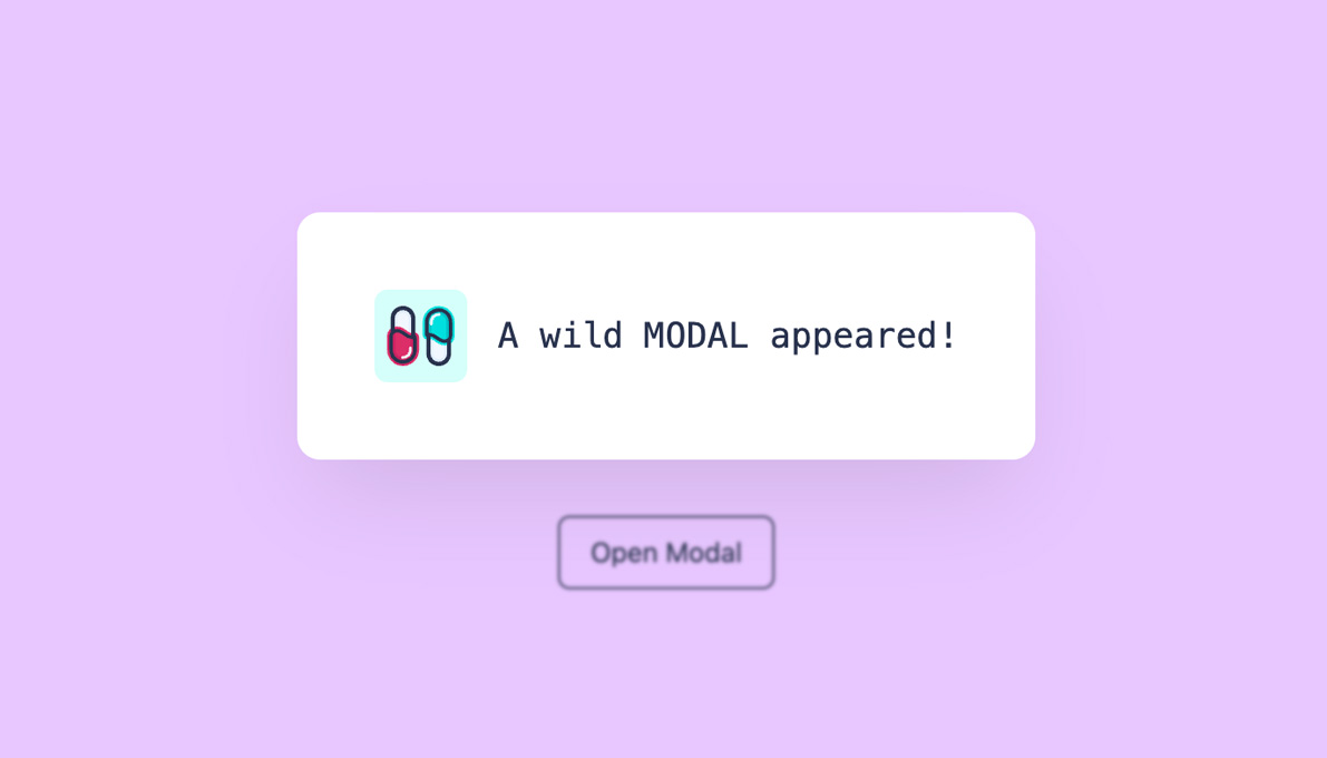
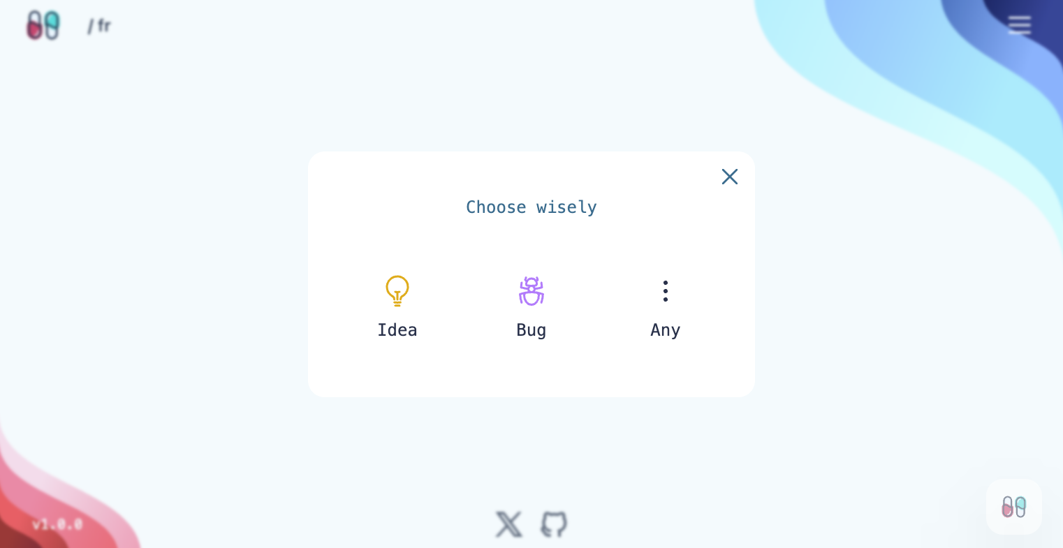
The Modal appears when clicking the button. It is now possible to customize the modal as desired: its position, dimensions, and actions. The Reaction component implemented on the Capsules Codes Blog is also the result of this method.
Glad this helped.


